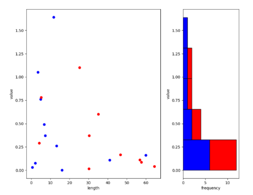
我正在嘗試plt.GridSpec()設置兩個子圖,使左邊的子圖占據大約 67% 的空間,右邊的子圖占據 33% 的空間。我查看了文檔,但我似乎無法弄清楚如何設置索引——可能是由于缺乏 numpy 切片的經驗??芍貜偷睦?matplotlib inlineimport matplotlib.pyplot as pltimport pandas as pd## Dummy Datax = [0, 0.03, 0.075, 0.108, 0.16, 0.26, 0.37, 0.49, 0.76, 1.05, 1.64, 0.015, 0.04, 0.085, 0.11, 0.165, 0.29, 0.37, 0.6, 0.78, 1.1]y = [16.13, 0.62, 2.15, 41.083, 59.97, 13.30, 7.36, 6.80, 4.97, 3.53, 11.77, 30.21, 64.47, 57.64, 56.83, 46.69, 4.22, 30.35, 35.12, 5.22, 25.32]label = ['blue', 'blue', 'blue', 'blue', 'blue', 'blue', 'blue', 'blue', 'blue', 'blue', 'blue', 'red', 'red', 'red', 'red', 'red', 'red', 'red', 'red', 'red', 'red', 'red']df = pd.DataFrame( list(zip(x, y, label)), columns =['x', 'y', 'label'] ) ## Plottingfig = plt.figure(figsize=([10,8]))grid = plt.GridSpec(1, 3, wspace=0.4, hspace=0.3)ax1 = plt.subplot(grid[0, :1])ax2 = plt.subplot(grid[0, 2], sharey = ax1)ax1.scatter(x=df.y, y=df.x, color=df.label)df_red = df[df['label'] == "red"]df_blue = df[df['label'] == "blue"]myhist = ax2.hist([df_blue.x, df_red.x], density=False, edgecolor='black', color=['blue', 'red'], cumulative=False, bins='auto', orientation='horizontal', stacked=True, label=['Blue', 'Red'])ax1.set_xlabel('length')ax1.set_ylabel('value')ax2.set_xlabel('frequency')ax2.set_ylabel('value')當前結果所需結果相同的圖,只是左:右比例為 67% : 33%(因此左圖比右圖寬)。
1 回答
POPMUISE
TA貢獻1765條經驗 獲得超5個贊
這是您需要進行的小修改:
# one position less than 3rd column
ax1 = plt.subplot(grid[0, :-1])
添加回答
舉報
0/150
提交
取消