布局如圖所示,1是一個有背景圖片的DIV容器,2是標題文字DIV,3是一張圖片,需要做一些動畫效果,這里為了標注方便所以畫了框,其實是需要撐滿整個1容器的,頁面需要做到全部自適應,縮放頁面不出現滾動條,也就是說1的大小是不一定的,所以問題就是怎么使用bootstrap做到在父元素寬度(橫向撐滿li瀏覽器頁面)和高度大小未知的情況下子元素撐滿整個DIV?
2 回答
慕森卡
TA貢獻1806條經驗 獲得超8個贊
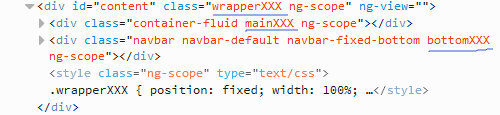
1 2 3 4 5 6 7 8 9 10 11 12 13 14 15 16 17 18 19 20 21 22 23 24 25 26 27 28 29 30 | <div id="content" class="wrapperXXX">
<div class="container-fluid mainXXX"> ... </div>
<div class="navbar navbar-default navbar-fixed-bottom bottomXXX"> <div class="container-fluid"> <h2>bottom div</h2> </div> </div>
</div>
<style type="text/css"> .wrapperXXX { position: fixed; width: 100%; height: 100%; }
.mainXXX { background-color: pink; height: 100%; }
.bottomXXX { background-color: lime; } </style> |
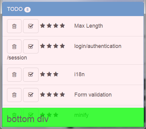
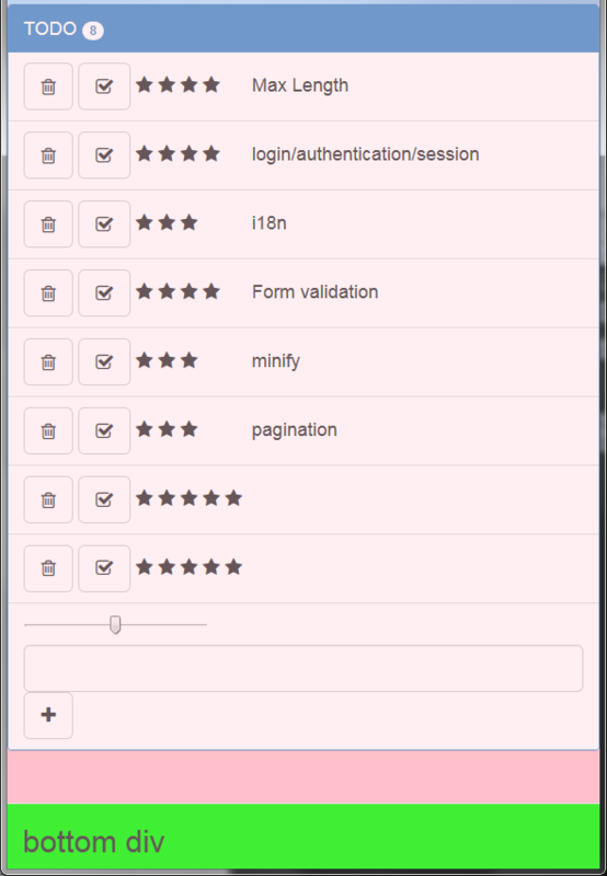
效果:
窗口縮小時:
拉大時:
- 2 回答
- 0 關注
- 692 瀏覽
添加回答
舉報
0/150
提交
取消